

Album Artwork
Atlas Gray planned to release four singles from their upcoming album, Through the Dark, and asked that each be paired with unique artwork.

Design Discovery
The first designs attempted were full color, combining multiple textures and techniques to create depth.
Ultimately these concepts were abandoned in favor of a flat design with careful use of white space.

Design Language
Specific symbols were treated with textures from tattoo art and linoleum printing to create a visual language in keeping with the style of the music.
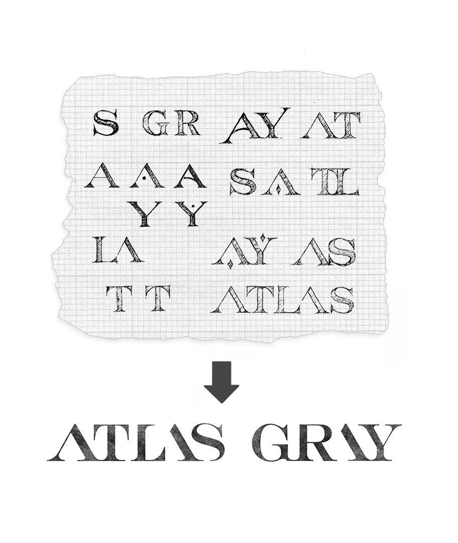
Logo Design
Atlas Gray had used a combination mark before 2020, but we decided to avoid the use of a symbol in favor of a straightforward wordmark design. I began with a clean and classic engraved typeface to evoke a feeling of strength and longevity, and modernized the mark by omitting the stems of specific characters.
